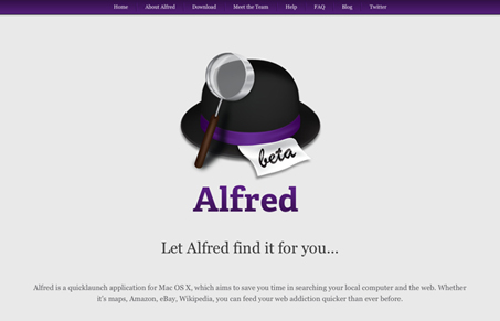
It’s not often you find a center aligned site and it’s cool. This one looks fantastic. I’m loving the minimal aspects to this design and the black and purple is a nice combo in this case. The Alfred logo/icon of the hat is also great, and could really become very recognizable indeed.


0 Comments