Submitted by: Adam Stoddard @vampeel
Role: Designer & Developer
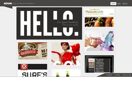
I designed this site to really showcase my work and not be visually distracting. The columns reflow from two to four depending on the width of the browser window.
Adam has done a pretty good job of not letting anything get in the way of his work. I like that it opens with ‘This is my work’. It’s simple and confident. I also appreciate that each link goes to a more detailed exploration of each item and his work is varied and interesting. My only criticism is the choice of fonts. There are 10 words on the home page, aside from the work, and 3 different fonts. The logo and the navigation have a very modern, almost tech-y vibe that doesn’t really jive with the italic serif of the subtitle. Otherwise it’s really nice little site that does a good job of showcasing Adam’s work, which is pretty much what he set out to do.


0 Comments