
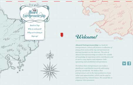
Intriguing visual design for the Aboard Entrepreneurship site. I like the old-timey looking map used for the background and visual metaphor. The static navigation widget is also nifty looking, making for a neat scrolling experience, like you’re on a ship charting your course or something. Cool concept.




There is a mistake in the link:
.com8/ >>>>> .com/
Regards