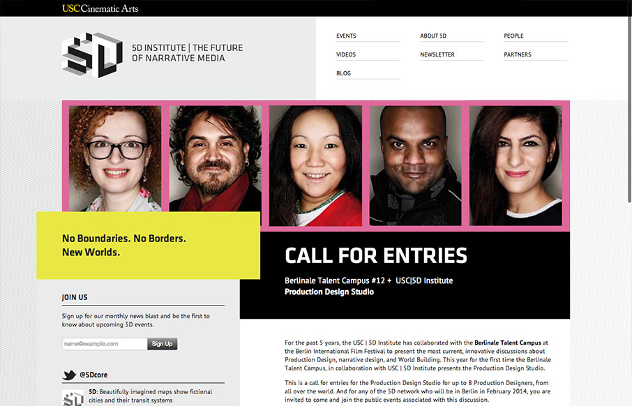
I was immediately drawn to this website by its unusual use of the grid on the larger screened “desktop” layout. The navigation and logo area are split into two 50% columns. This simplicity allows other elements to be moved purposefully “off grid”. It’s eye-catching, how the yellow “no boundaries…” box protrudes into the main image and headline, and how the headline text is pulled left off centre. This visually striking grid is carried through to the inner pages.
The use of greyscale and one vibrant accent colour, along with a simple bold, capitalised font for headers lends a feeling of gravitas and energy.
Responsively, it’s refreshing to see a website that doesn’t simply hide its navigation behind a dropdown at smaller screen sizes. I’m also happy to see the website go beyond the 960px grid. The page weight comes in at a reasonable 500k – not too bad but not blazingly quick. The main image is 250k so it shouldn’t be too difficult to reduce that by at least 50%.


0 Comments