
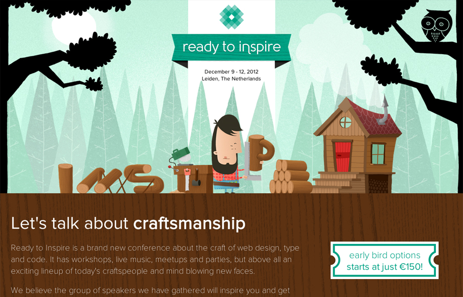
The 2012 Inspire Conference website is wonderfully illustrated. I like the little lumberjack dude and how it’s all tied into the theme. Nice responsive design too. Lovely site and it looks like a kick-ass conference too!


Fitts’s Law: Why the Easy Button Wins
Large, close targets are faster to hit than small, distant ones, that’s Fitts’s Law. A look at the 1954 rule behind buttons, prime and magic pixels, thumb zones, and dark patterns.


Thanks! A bit of background on the illustrations: http://www.nozzman.com/inspire-conference-2012