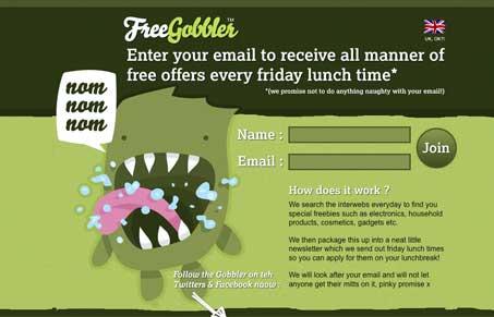
There’s really not much here aside from a nice illustration. Without that the whole thing really falls apart, but that’s my point with featuring this site. I see a lot of websites that are just the typical formula for trendy website design, what I don’t see a lot of is real conceptual work. When I do come across a nice concept, like this it’s really refreshing and makes me take notice. The concept of the “Gobbler” monster and the illustration really sell this little service. It’s not complex it’s just an email list but the monster makes it happen.
Glassmorphism: The Transparent Design Trend That Refuses to Fade
Glassmorphism brings transparency, depth, and light back into modern UI. Learn how this “frosted glass” design trend enhances hierarchy, focus, and atmosphere, plus how to implement it in CSS responsibly.


colors are nice too.