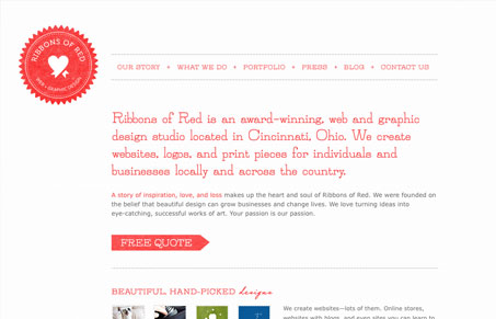
I love ribbonsofred.com! This site is so beautifully simple and full of perfect little details. It’s minimalism at it’s best in my opinion. The color palette is a simple red(ish) and gray so things that are important look important, the typography uses hierarchy in the way you’re supposed to as well. Give the screen cast review with Gio and myself a watch to here what we thought about this design in more detail.
Glassmorphism: The Transparent Design Trend That Refuses to Fade
Glassmorphism brings transparency, depth, and light back into modern UI. Learn how this “frosted glass” design trend enhances hierarchy, focus, and atmosphere, plus how to implement it in CSS responsibly.


0 Comments