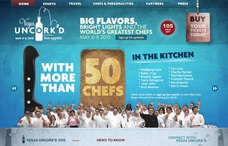
This conference has a great brand which has been translated into a great website and they’ve even thought of a lot of small places to implement it like in their video, loading screen, favicon, a mobile version of the site – and even the send button on the contact form!
I’m loving the foil texture of the background. The design tends to have a cool and crisp feel to it with the blue and silver background – highlighted by small lines marking off most edges. I also like the easy organization of their event calendar with the large dates at the top. They had to go off-site for the ticket selling page but continued the brand over as much as possible which was not a bad transition.


0 Comments