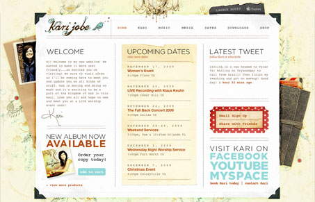
I love the texture and subtle color in this design. There is a ton of nice detail work and completeness to this design. I’m not wild about the main font chosen for all the copy, but I love the way the headlines are treated. They’ve now put up a splash page before this lovely site, I understand the strategic importance of that, but I’m not a fan of splash pages. The one thing I love is that they don’t immediately blast you with music on this site, they let me have the option to turn it on, that’s just smart and kind.
Glassmorphism: The Transparent Design Trend That Refuses to Fade
Glassmorphism brings transparency, depth, and light back into modern UI. Learn how this “frosted glass” design trend enhances hierarchy, focus, and atmosphere, plus how to implement it in CSS responsibly.


0 Comments