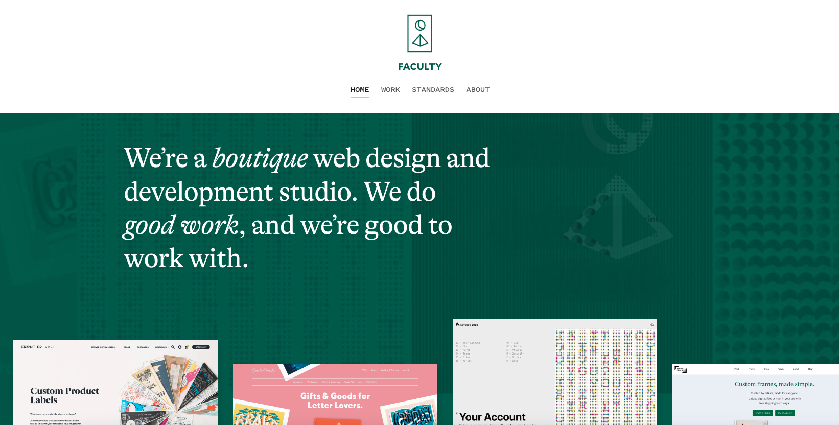
I really, really love the simplicity in this design/layout. Simple isn’t the right term, it’s minimal. Which is super difficult to achieve and they’ve done it. Bravo.
Glassmorphism: The Transparent Design Trend That Refuses to Fade
Glassmorphism brings transparency, depth, and light back into modern UI. Learn how this “frosted glass” design trend enhances hierarchy, focus, and atmosphere, plus how to implement it in CSS responsibly.


0 Comments