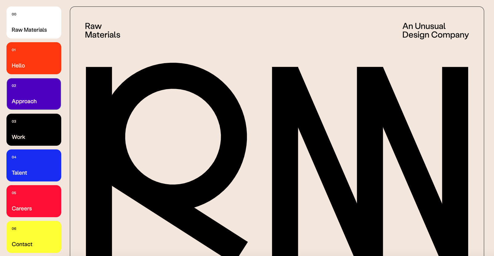
Raw Materials takes an unconventional approach by not featuring images of their work above the fold on their single-page site, necessitating scrolling to reach the work section. However, their effective use of bright colors and large typography adeptly conveys their unique ethos and approach.
Glassmorphism: The Transparent Design Trend That Refuses to Fade
Glassmorphism brings transparency, depth, and light back into modern UI. Learn how this “frosted glass” design trend enhances hierarchy, focus, and atmosphere, plus how to implement it in CSS responsibly.


0 Comments