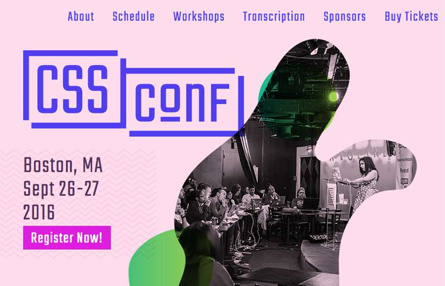
Really smart looking site for the 2016 CSS Conf website. I love the shapes and how they layer as you scale the browser down. Something for us Frontenders to dig on. Overall straight forward layout too, dig it in a big way.
Glassmorphism: The Transparent Design Trend That Refuses to Fade
Glassmorphism brings transparency, depth, and light back into modern UI. Learn how this “frosted glass” design trend enhances hierarchy, focus, and atmosphere, plus how to implement it in CSS responsibly.


very nice https://uploads.disquscdn.com/images/727c4299eb6fab506137d1003f9dd2755614c4aed3c4e13add34898b5a8c59be.jpg