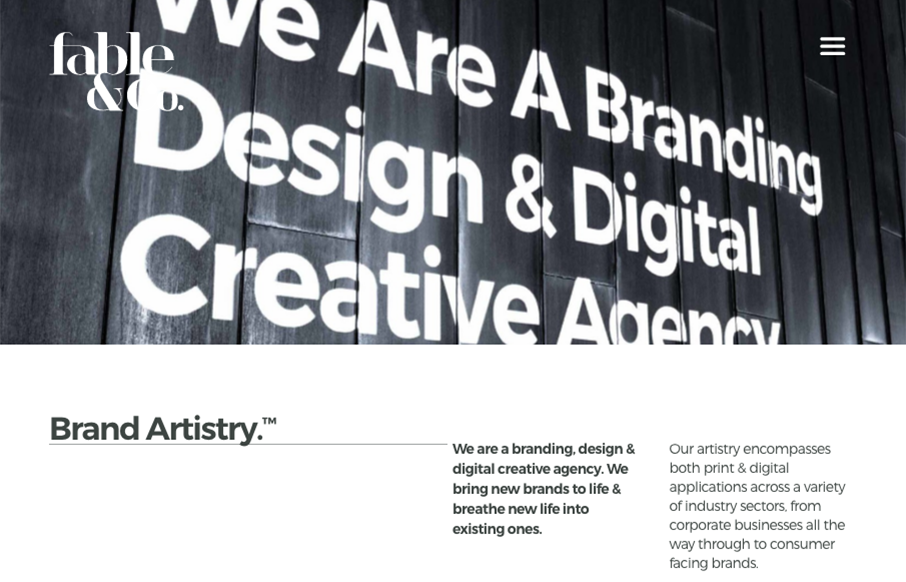
The first thing I see when I check this site out is the use of typography within the imagery. Very cool. I also love the use of color being minimal and only on instances where work is being shown off. Good stuff, subtle design. Bravo.


The Call to Action, Revisited
The Call to Action hasn’t changed in a decade, but the bar has. A fresh look at prominence, copy, mobile tap targets, and accessibility, with lessons from three major design systems.


0 Comments