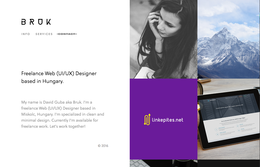
Real simple design for Bruk but it also has some really nifty UI details. The left vs. right look is pretty cool and the “X” that stays visible when you check out some of the work is pretty clever too.
Glassmorphism: The Transparent Design Trend That Refuses to Fade
Glassmorphism brings transparency, depth, and light back into modern UI. Learn how this “frosted glass” design trend enhances hierarchy, focus, and atmosphere, plus how to implement it in CSS responsibly.


0 Comments