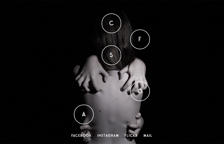
Love this photo portfolio site for Jolien Roos out of Belgium – looks to by @studiosiebe. Very unique intro/navigation, five circles that turn into your “hamburger” as you move through the site. For photography sites – the images sell it – and the full width / full height is perfect!
Glassmorphism: The Transparent Design Trend That Refuses to Fade
Glassmorphism brings transparency, depth, and light back into modern UI. Learn how this “frosted glass” design trend enhances hierarchy, focus, and atmosphere, plus how to implement it in CSS responsibly.


0 Comments