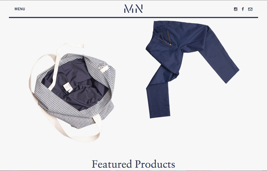
Pretty cool angle on some now-standard design patterns. I love how the header has that line and everything perfectly scroll-folds up into it. Then the menu is cool, all the lines and blockiness of it make it feel really fresh to me.
Glassmorphism: The Transparent Design Trend That Refuses to Fade
Glassmorphism brings transparency, depth, and light back into modern UI. Learn how this “frosted glass” design trend enhances hierarchy, focus, and atmosphere, plus how to implement it in CSS responsibly.


0 Comments