
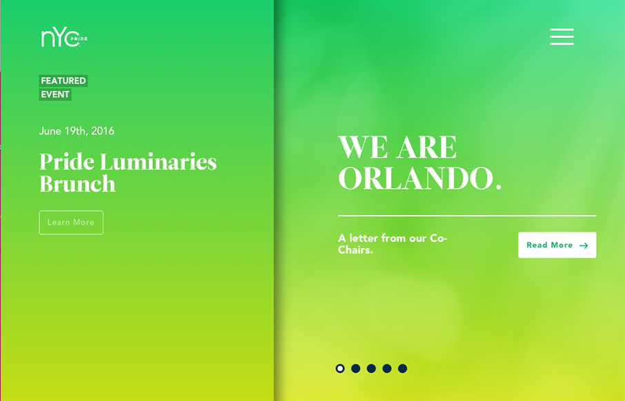
Really unique website experience here for the NYC Pride site. I really really love how it’s a wholly different experience for desktop vs. mobile. Literally different styles of interaction. I dig the monochromatic color palette a great deal too. The overlay nav design is chock full of stuff which is okay, i’d love to see it simpler but there’s a ton there to get to. Good work all around here!


Chunking: How to Design for a Brain That Can Only Hold Four Things
Your working memory holds about four things, not seven. Chunking groups loose information into meaningful units that slip past that limit, the psychology behind phone numbers, scannable pages, multi-step forms, and grouped navigation.


0 Comments