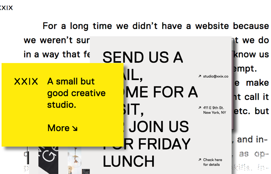
A good way to show you’re a “new” type of interactive firm is to show it off in your work. Twenty Nine NYC doest that well here with their website. It’s not the most highly functioning site in terms of pure usability but it’s not that bad and it’s creative at the same time. It goes well with their mission and what they are all about.
Glassmorphism: The Transparent Design Trend That Refuses to Fade
Glassmorphism brings transparency, depth, and light back into modern UI. Learn how this “frosted glass” design trend enhances hierarchy, focus, and atmosphere, plus how to implement it in CSS responsibly.


0 Comments