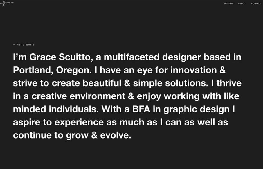
I love the large block of copy on that dark background and then *BANG* you get some animated work samples loaded up on you. Good stuff. That slow color change on the background is nice too, it changes the entire experience in just that little shift.
Glassmorphism: The Transparent Design Trend That Refuses to Fade
Glassmorphism brings transparency, depth, and light back into modern UI. Learn how this “frosted glass” design trend enhances hierarchy, focus, and atmosphere, plus how to implement it in CSS responsibly.


0 Comments