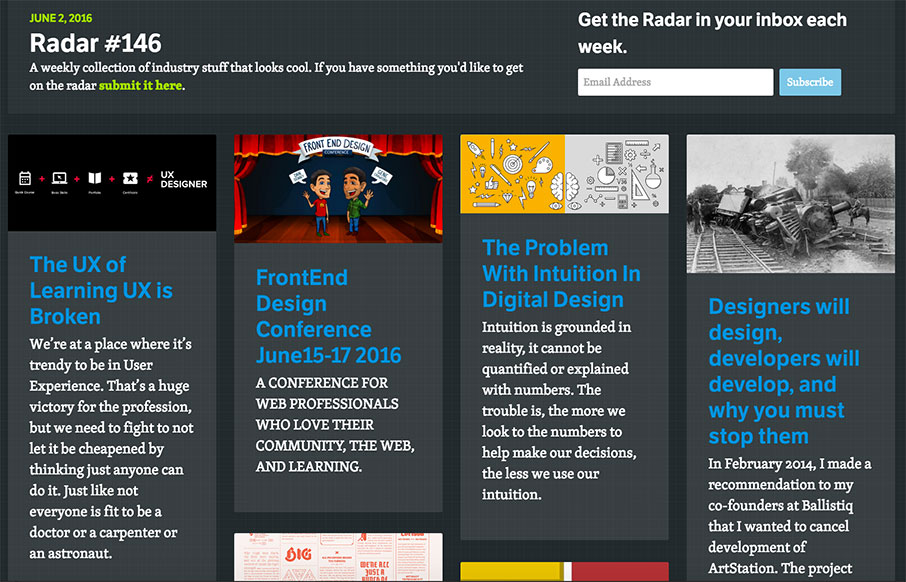
Each week, we do a round up of curated “stuff from the interwebs” that we call Radar.
The UX of Learning UX is Broken
We’re at a place where it’s trendy to be in User Experience. That’s a huge victory for the profession, but we need to fight to not let it be cheapened by thinking just anyone can do it. Just like not everyone is fit to be a doctor or a carpenter or an astronaut.
FrontEnd Design Conference June15-17 2016
A CONFERENCE FOR WEB PROFESSIONALS WHO LOVE THEIR COMMUNITY, THE WEB, AND LEARNING.
The Problem With Intuition In Digital Design
Intuition is grounded in reality, it cannot be quantified or explained with numbers. The trouble is, the more we look to the numbers to help make our decisions, the less we use our intuition.
Designers will design, developers will develop, and why you must stop them
In February 2014, I made a recommendation to my co-founders at Ballistiq that I wanted to cancel development of ArtStation. The project was in development hell. It wasn’t going anywhere. I was unhappy with it and just couldn’t see a path for it to be a successful product. Two months later we managed to launch […]
The Value of Multi-Typeface Design
I’ve seen countless articles written on typeface pairing and systems, and nearly all of them push towards using fewer families in any given design. I’ve seen similar comments made towards my own work, implying that they are pleasing despite the number of typefaces they use.
Top Ten Mistakes while Implementing Responsive Web Design
Responsive web design is evolving considerably every day. But not every business is able to implement responsive web design on sites, the right way. Also, it is important to know that responsive design is a process of continual improvement.
Designing Data-Driven Interfaces
Telling the story of your data
How To Utilize Negative Space in Web Design
There are many fundamental principles of art & design which are crucial for every web designer to understand. One such principle is negative space, also known as white space. The use of white space can be difficult to explain but it’s much more obvious via example.
How To Nail a Design Job Interview
“Treat your job interview like a design problem.” This week, we asked design leaders to share their advice on how to be successful during a job interview.
Effective Logo Design, Part 2: Using Nature’s Patterns In Logo Design
There are only a handful of fundamental patterns that create all of the natural diversity around us. Nature’s patterns perform three basic tasks that get the work of the universe done by moving, storing and connecting energy.
If you want to add something to next week’s Radar – submit it here.
Here’s the link to this week’s batch of goodness: Radar #146.


0 Comments