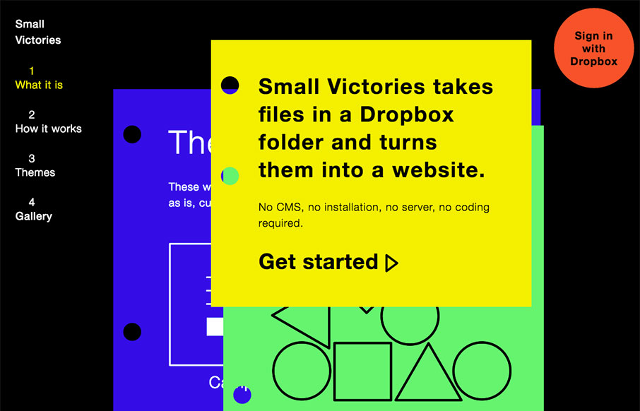
Pretty cool idea, but also a pretty cool site design. I dig how it’s a hybrid scroll and page site. It’s like you’re flipping through pages as you scroll down. Kinda drives the idea home that it publishes stuff in your dropbox box as pages. Clever and well done.
Glassmorphism: The Transparent Design Trend That Refuses to Fade
Glassmorphism brings transparency, depth, and light back into modern UI. Learn how this “frosted glass” design trend enhances hierarchy, focus, and atmosphere, plus how to implement it in CSS responsibly.


0 Comments