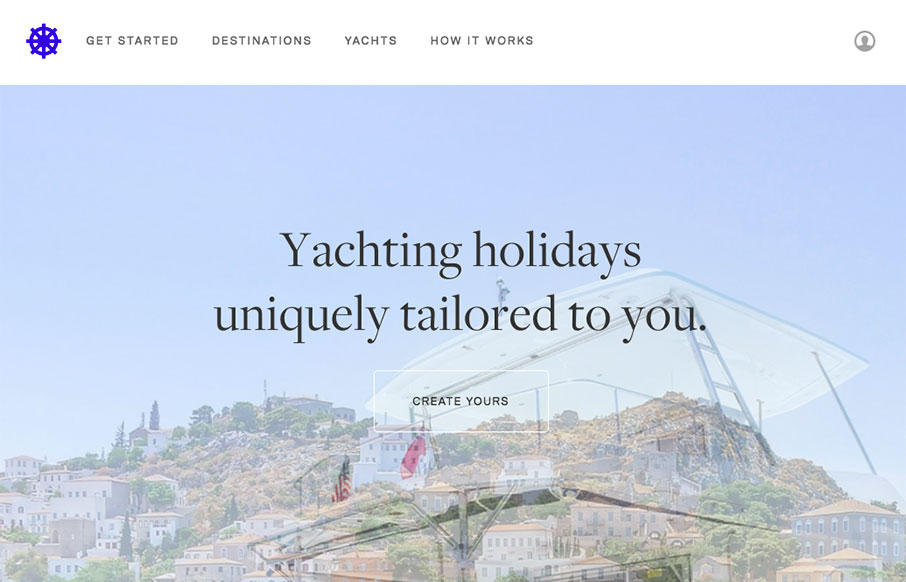
I like how this design feels very open. The interactive parts are sort of placed on top of the imagery to make it feel like it’s floating there. There is also a play between the back and forward arrows and the entire, oversized, image changing out too. Cool visual moment.
Glassmorphism: The Transparent Design Trend That Refuses to Fade
Glassmorphism brings transparency, depth, and light back into modern UI. Learn how this “frosted glass” design trend enhances hierarchy, focus, and atmosphere, plus how to implement it in CSS responsibly.


0 Comments