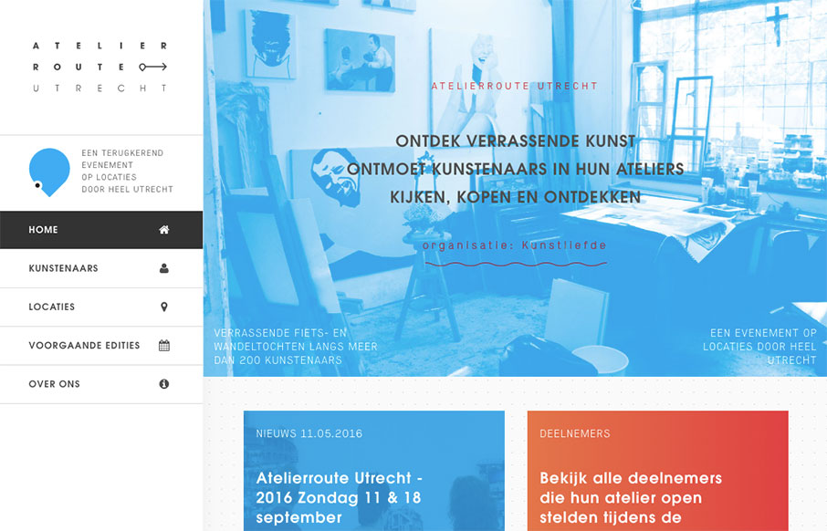
Nice left nav layout approach to this website. I dig the straight up hard angles and blockiness to it too. Asymmetry is a good thing!
Glassmorphism: The Transparent Design Trend That Refuses to Fade
Glassmorphism brings transparency, depth, and light back into modern UI. Learn how this “frosted glass” design trend enhances hierarchy, focus, and atmosphere, plus how to implement it in CSS responsibly.


0 Comments