If you’ve come across sites that are easy to navigate, chances are you have experienced good information architecture. IA is a crucial step in the site design process to create clear site navigation. Although we typically document IA in the form of sitemaps, in my ten years as an IA practitioner, this diagram has been a common pain point for client communication. It takes a leap of imagination to see how lines and boxes translate into a smooth user experience. In one of our recent projects we decided to ask ourselves, what happens if we skip it?
What is IA?
Information Architecture is a process that helps define the structure, functionality and nomenclature of a site. Similar to the way traditional architects make choices about the layout of a building according to the way it will be used, information architects make decisions for website organization to facilitate clear navigation. A good IA helps site users understand where they are, how to navigate a site and how to find what they are seeking. This process can make a significant impact on the success of a site and its ability to communicate with its customers, sell products or provide a service. IA is one of the first steps in all site design projects at eHouse Studio.
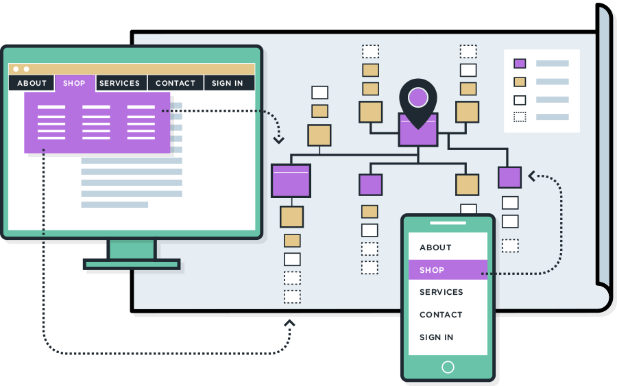
Once a building structure has been designed, signage can be created to help visitors navigate from room to room. In a similar way, once the information architecture is complete, navigation can be designed to help users navigate a website. Site navigation is built upon the framework of IA.
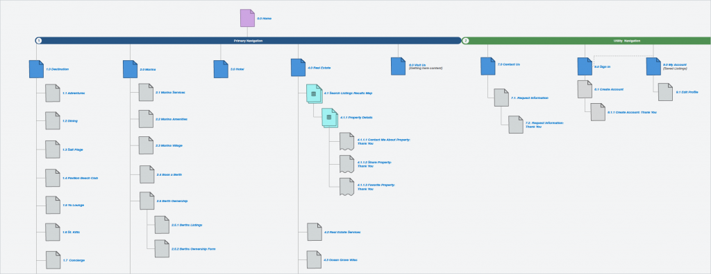
Sitemap from Christophe Harbor site redesign:

Header navigation on the Christophe Harbor site (desktop):

The IA process
The process by which we make recommendations on the structure of the website requires us to carefully evaluate a variety of factors. If a site already exists, there is a lot we can learn from the existing content and user experiences. We also want to carefully consider the business strategy, analytics, competition and best practices to come up with recommendations that will result in an exceptional user experience. The process looks something like this:

IA documentation
IA is a planning phase of the project which is reflected in the final deliverables in the form of navigation. Since IA isn’t a tangible deliverable, we need some way to communicate the site structure recommendations in order to align with decision makers, developers, designers and content writers so that everyone is clear on the effort ahead.
The sitemap is a standard document deliverable that has been produced for this point of alignment for as long as I can remember. The goal of a sitemap is to create a visual representation of the organization of a site. It takes time to create and, as designers, we go through a lot of effort to make them clear and informative.
The problem for customers
Looking back at my nineteen years in the web design industry (ten years creating sitemaps), helping clients interpret this document has always been a challenge. It takes a leap of imagination to go from squares connected with lines to imagining how one might navigate a site. There is a risk that the project team and client won’t fully understand what this means to the user experience until they see the navigation. There is also a risk that we will spend time iterating on the sitemap, only to find that we make additional changes once we see the navigation. This effort doesn’t seem like a great use of our clients’ time and budget as the document itself is not the final product.
Always improving the customer experience
Since I started working at eHouse Studio (about three years ago), one of the things I’ve enjoyed is the constant evolution of the process to improve customer experience, both for our clients and their customers. In the past year, we switched to an Agile process as well as showing clients only coded deliverables in an actual browser. These changes have produced a huge leap forward in project success for both our internal team and our clients.
One aspect of the Agile process that our clients appreciate is the road mapping phase where both the project and client teams can align on the most impactful efforts for the project budget. This process has inspired our team to re-evaluate even some of our standard practices to make sure they are the most effective way to provide value for our clients. We recently worked on a relatively small site redesign project and discovered an opportunity to streamline our process further.
A new approach
Part of our goal with the agile process has been to reduce the time spent iterating and discussing deliverables that aren’t in the form of the final product. Over the last year, we have moved from presenting static UX and UI to only showing our work to clients in code. This workflow helps us reduce the imagination gap for the whole team as far as seeing how a page will look and function in the browser as well as to immediately test the feasibility of our designs. We decided to try the same principle for the IA. The project for which we attempted this approach was relatively small, so an outline was sufficient for communicating the overall structure of the site to the team (a spreadsheet would probably be better for something larger). Once we were comfortable with the outline, we quickly sketched out how this structure would translate to the navigation and got it into code. Within a few days, we had created a fully responsive HTML prototype of the navigation and were able to experience as it would function on the final site.
The Result
For the IA demo, we presented the client with a few things. We started by walking them through the goals and our thought process in order to align on why we made the recommendations that we did for the grouping and naming of sections of the site. We then showed them a working HTML prototype of how these decisions influenced the navigation.
The demo created a great conversation with our client. They could immediately see the site as the users would experience it – the options they would see up front and how they would uncover the secondary navigation. Rather than spending the time trying to explain to our client what a sitemap diagram represents, we were able to collaborate with them around their business goals and how to better communicate with their customers.
Since we were reviewing HTML prototypes, we implemented changes directly in the code as the client requested them. Before they left our office, they could see the result of decisions made by the group in the form of coded responsive navigation. The result was a big win for everyone. The client felt satisfied that the project was on track, and the team could move forward without any additional revision time or back and forth to discuss feedback. Also, the navigation, which is often one of the more challenging development pieces of the site, was half-way complete by the first client demo.
Goodbye sitemap diagram?
Removing the sitemap from this particular project was a good choice. An outline provided sufficient information grouping to create a navigation prototype. And the prototype was helpful for the client to envision the impact on user experience.
While every project is different, what we took away from this experience was that the standard deliverable is not always right for every project. The next time we go through the information architecture process, we will be asking ourselves:
- Is a sitemap effective to experience and evaluate site structure?
- Does a sitemap add value for this project?
- Is a sitemap the most efficient tool to align on site structure and taxonomy?
If the answer is no, it may be an opportunity to spend the project budget on a more impactful effort for our client.
This article was originally published by eHouse Studio here.


0 Comments