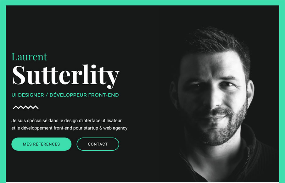
I love this design. The colors feel very “new” to me, like i’ve not seen it yet. The layout is pretty straight forward but really boosted by the imagery and type. I freaking love the interactions on the buttons. So good.
Glassmorphism: The Transparent Design Trend That Refuses to Fade
Glassmorphism brings transparency, depth, and light back into modern UI. Learn how this “frosted glass” design trend enhances hierarchy, focus, and atmosphere, plus how to implement it in CSS responsibly.


0 Comments