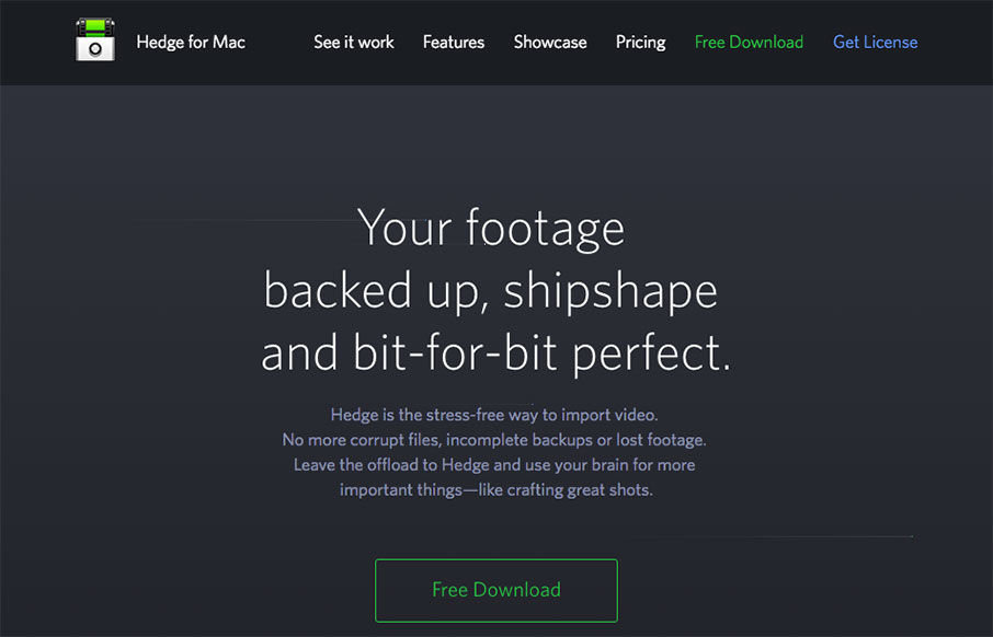
Pretty nifty app/product website. I dig the animated piece that explains what the app does and how it works. Also nifty that it’s largely a dark background site.
Wanting to showcase Hedge’s main features we chose to feature an animation combined with a a long form website explaining Hedge in depth. Check out the particles in the header. There’s a modal behind the download button, and the newsletter signup has some nice error-catching UX behind it.


Thanks for the kind words Gene! There’s a reason for the dark theme: the landing page is aimed at new visitor, that are unfamiliar with Hedge. They’re “in the dark”. We’ll be releasing content pages soon, with more in depth information for existing users, and they have a light theme.