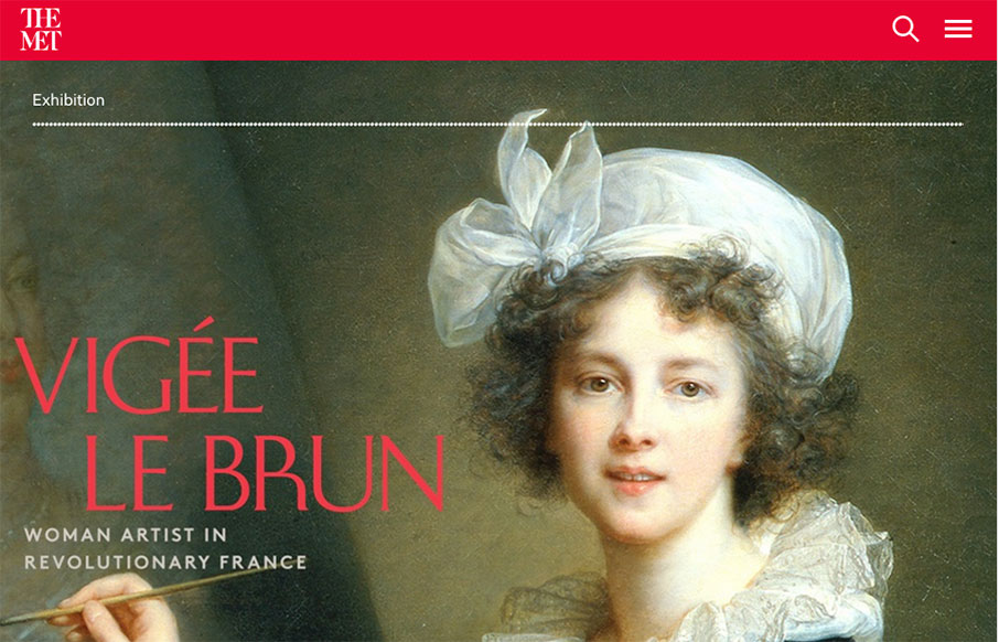
Holy cow, where to start. Really, it’s a huge website with tons of content and the designers have done a superb job of getting you at it. All the while maintaining style and vibe that matches the Met. Spend some time going through this site okay, you’ll dig it.
Glassmorphism: The Transparent Design Trend That Refuses to Fade
Glassmorphism brings transparency, depth, and light back into modern UI. Learn how this “frosted glass” design trend enhances hierarchy, focus, and atmosphere, plus how to implement it in CSS responsibly.


0 Comments