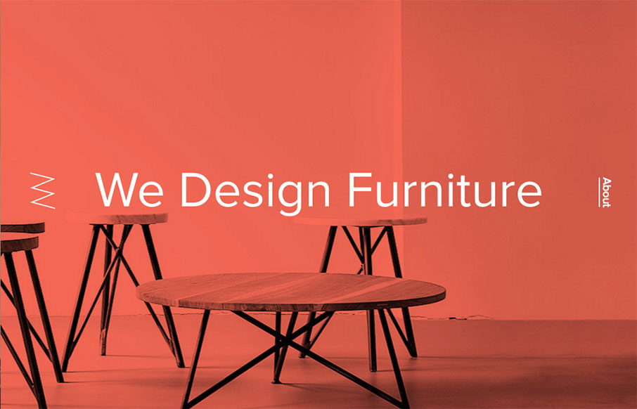
Out of Berlin – Nut & Woods’ site is pretty tight. The best thing about the site has to be the navigation – hover over the “Tables” nav item – see the “dropdown” – but then (since they are selling stuff) the dropdown nav cycles through the product categories automatically, giving you more incentive to click. Way cool.
Glassmorphism: The Transparent Design Trend That Refuses to Fade
Glassmorphism brings transparency, depth, and light back into modern UI. Learn how this “frosted glass” design trend enhances hierarchy, focus, and atmosphere, plus how to implement it in CSS responsibly.


0 Comments