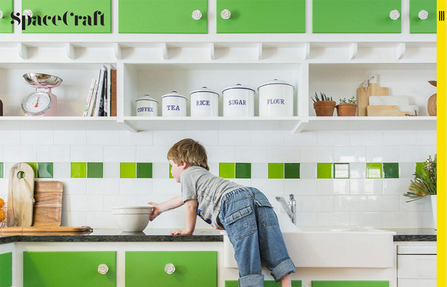
Two things about the Spacecraft site out of Australia I like are the vertical hamburger (because it is technically different than all the others) – and I like the simplicity of the mouse-over / overlays on the block design – it’s just a label and change in opaqueness – but it’s probably just what that area needs.
Glassmorphism: The Transparent Design Trend That Refuses to Fade
Glassmorphism brings transparency, depth, and light back into modern UI. Learn how this “frosted glass” design trend enhances hierarchy, focus, and atmosphere, plus how to implement it in CSS responsibly.


0 Comments