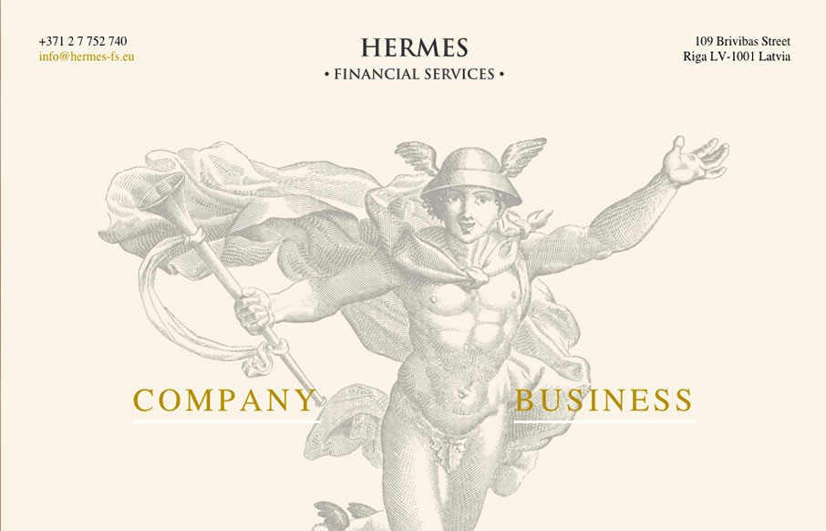
This Latvian site for Hermes Financial Services is extremely minimal… but we like it because of that. Very simple and to the point, but also has a good look to the site – from the Hermes illustration, to the coloring and fonts.
Glassmorphism: The Transparent Design Trend That Refuses to Fade
Glassmorphism brings transparency, depth, and light back into modern UI. Learn how this “frosted glass” design trend enhances hierarchy, focus, and atmosphere, plus how to implement it in CSS responsibly.


0 Comments