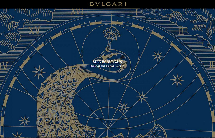
Now this is a great looking magazine from Bulgari out of Italy. There’s very little explanation on the site, but it looks like this is a supplementary site for the Bulgari site, that shows the lifestyle of / aspire, of the brand’s clientele. It’s beautifully done – great imagery – fairly seamless. Also like how they use the pre-loader for the site to be the instructions of how to navigate the site – smart use of a normally painful thing.
Glassmorphism: The Transparent Design Trend That Refuses to Fade
Glassmorphism brings transparency, depth, and light back into modern UI. Learn how this “frosted glass” design trend enhances hierarchy, focus, and atmosphere, plus how to implement it in CSS responsibly.


0 Comments