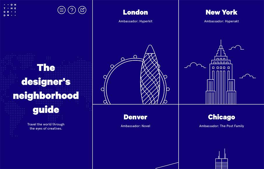
Pretty cool layout. I like the fixed side bar nav and the illustrations that train your eye on each neighborhood section. Which are all designed quite well using a card style design approach. Check out an example of that here.
Glassmorphism: The Transparent Design Trend That Refuses to Fade
Glassmorphism brings transparency, depth, and light back into modern UI. Learn how this “frosted glass” design trend enhances hierarchy, focus, and atmosphere, plus how to implement it in CSS responsibly.


0 Comments