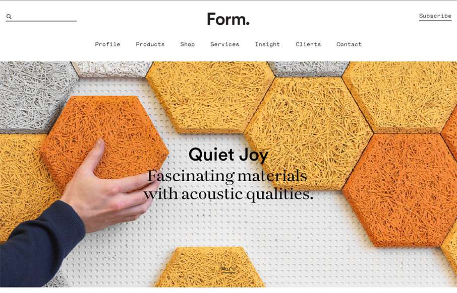
Beautiful minimal products deserve a website that matches. The Form website doesn’t fall short. A simple and elegant grid layout mixed with some simple type and photo direction make for a really great product website.
Glassmorphism: The Transparent Design Trend That Refuses to Fade
Glassmorphism brings transparency, depth, and light back into modern UI. Learn how this “frosted glass” design trend enhances hierarchy, focus, and atmosphere, plus how to implement it in CSS responsibly.


0 Comments