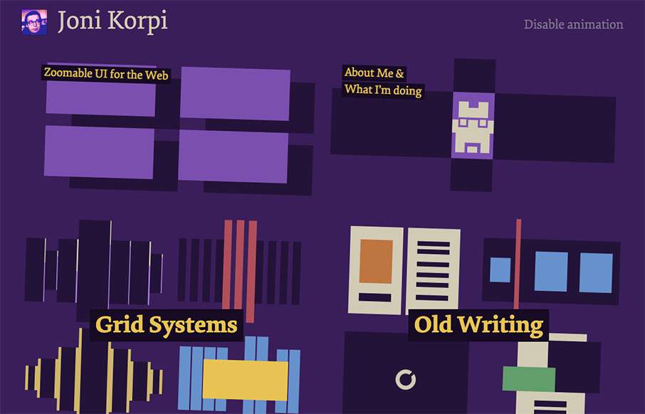
I’ve seen a couple of sites last year that had something similar to what Joni Korpi is doing with his portfolio site, doing zoomable UI for the web. His is pretty smooth. Here’s a little bit about his work, the why and how:
Glassmorphism: The Transparent Design Trend That Refuses to Fade
Glassmorphism brings transparency, depth, and light back into modern UI. Learn how this “frosted glass” design trend enhances hierarchy, focus, and atmosphere, plus how to implement it in CSS responsibly.


0 Comments