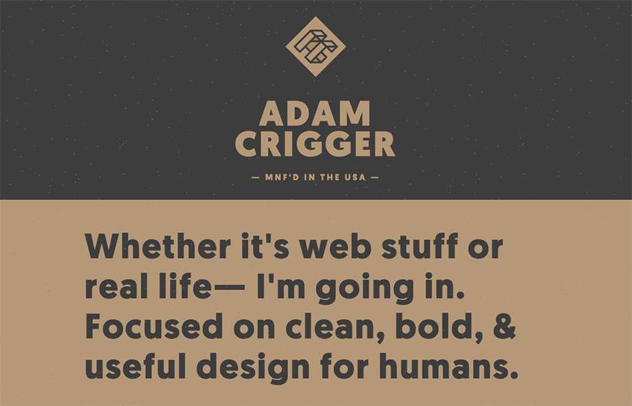
Well, damn. Adam Criggger – well done. He’s made his portfolio / resume site look unique, subtle and clean. And the fact that he has a seemingly out of place Biggie Smalls quote and video hanging out on the site, with the star field background floating through… brilliant!
Glassmorphism: The Transparent Design Trend That Refuses to Fade
Glassmorphism brings transparency, depth, and light back into modern UI. Learn how this “frosted glass” design trend enhances hierarchy, focus, and atmosphere, plus how to implement it in CSS responsibly.


0 Comments