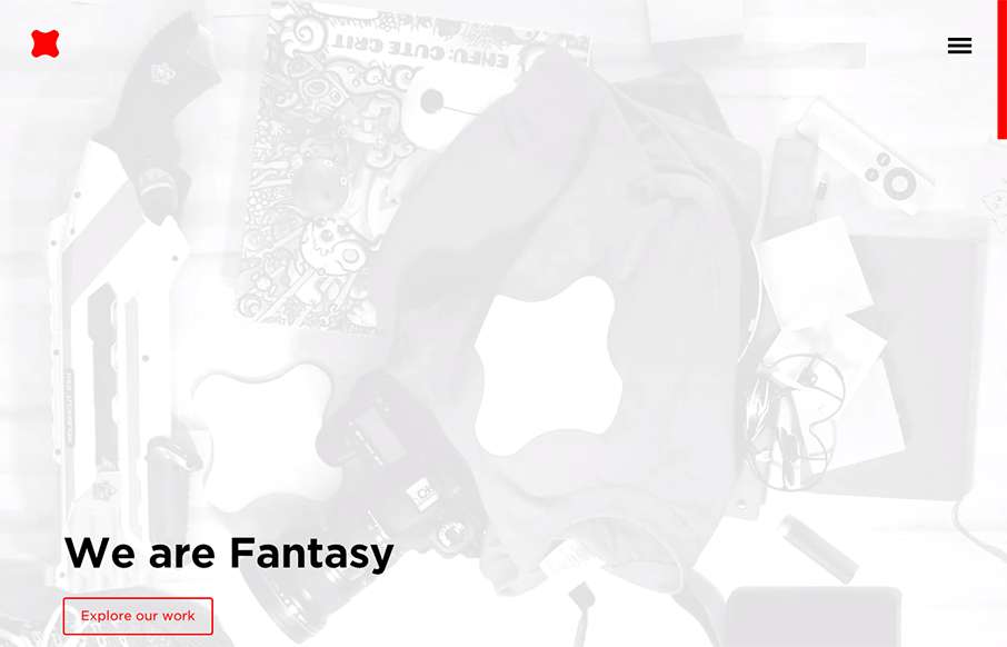
Newly updated (not sure how long) design for Fantasy Interactive. It’s amazing to me to see this design, i’ve followed Fantasy for the entire time they’ve been around. You can almost track the times in design from their websites over the years. this iteration is a great example of what today’s design aesthetic is about. Just check it out and if you know anything about these folks you’ll see what i’m talking about.
Glassmorphism: The Transparent Design Trend That Refuses to Fade
Glassmorphism brings transparency, depth, and light back into modern UI. Learn how this “frosted glass” design trend enhances hierarchy, focus, and atmosphere, plus how to implement it in CSS responsibly.


0 Comments