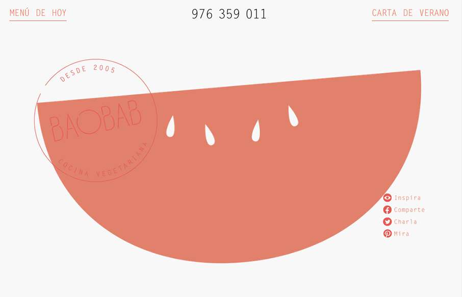
I really like the open feel to this design. The typography and the way it interacts with the white space is also pretty nice in that it feels vibrant and not just minimal. Love the colors and implied simplicity behind the visual layout too.
Glassmorphism: The Transparent Design Trend That Refuses to Fade
Glassmorphism brings transparency, depth, and light back into modern UI. Learn how this “frosted glass” design trend enhances hierarchy, focus, and atmosphere, plus how to implement it in CSS responsibly.


0 Comments