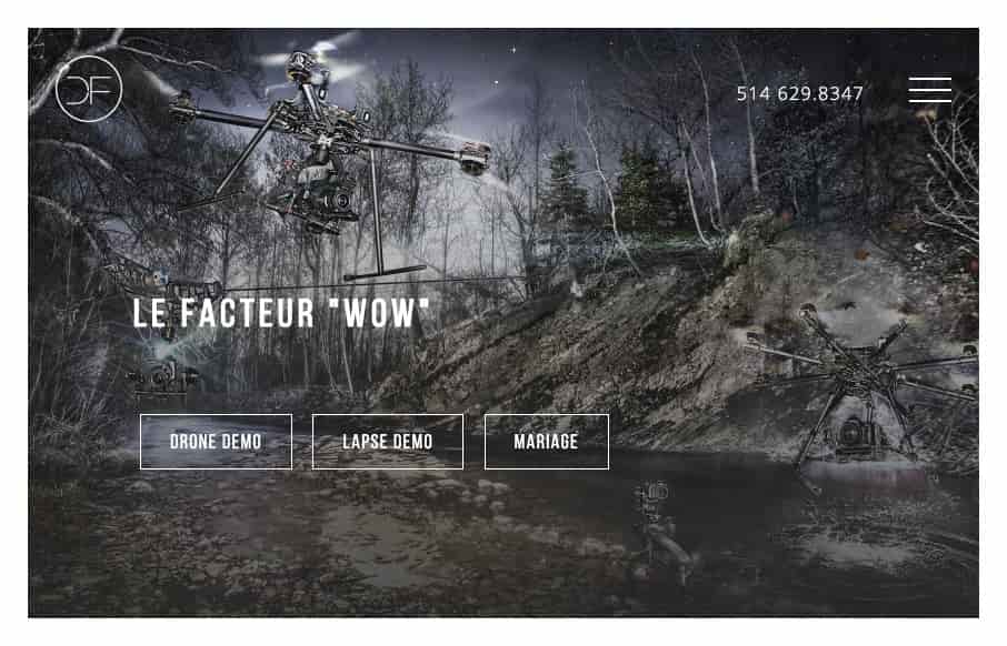
My first thought when I went to this site was “wow, damn nice photography” then I was like, “what’s up with that hamburger menu design…” As I considered the design though, I realized that those main 3 links/buttons are really all the company wants you to check out. The hamburger menu is secondary, that’s the shiz.
Glassmorphism: The Transparent Design Trend That Refuses to Fade
Glassmorphism brings transparency, depth, and light back into modern UI. Learn how this “frosted glass” design trend enhances hierarchy, focus, and atmosphere, plus how to implement it in CSS responsibly.


0 Comments