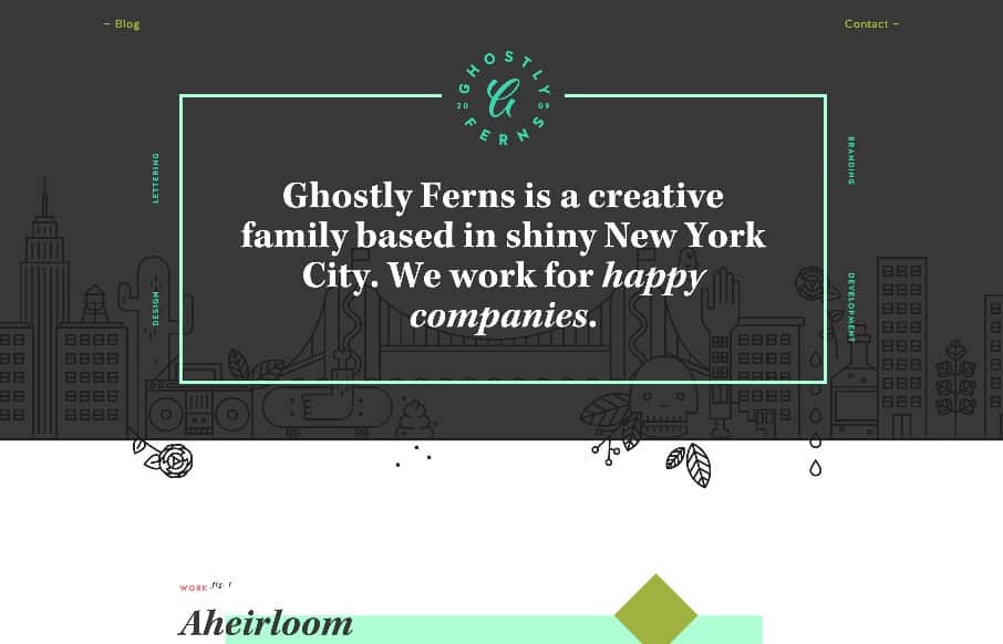
Like this site from Ghostly Ferns out of Brooklyn – a design studio, made up of freelancers. It’s fun and has depth with the shapes / illustrations / patterns. What I really like is the link off to each one of the freelancer’s work sites – that are similar, but different. In our site redesign for www.soco-work.com, we’ve been trying to come up with a good way to showcase our freelancers out of the co-work we run, SOCO. Like the site – gonna copy it (just kidding).
Glassmorphism: The Transparent Design Trend That Refuses to Fade
Glassmorphism brings transparency, depth, and light back into modern UI. Learn how this “frosted glass” design trend enhances hierarchy, focus, and atmosphere, plus how to implement it in CSS responsibly.


0 Comments