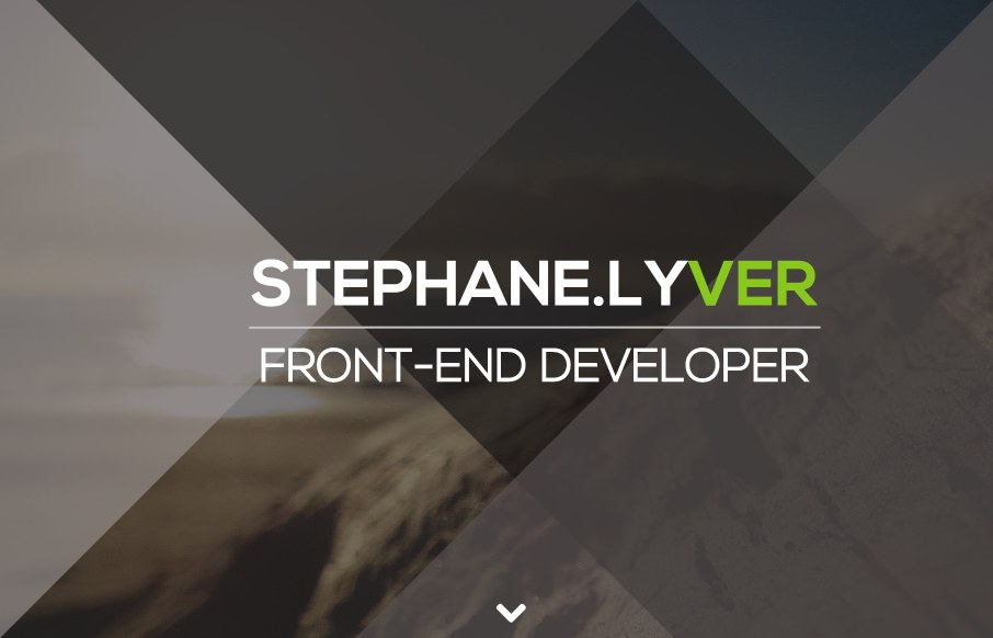
I love this simple and colorful site for Stephane Lyver. It seems to have minimal design, but the colorful sections draw my attention. I love his black and white ending portrait shot, and I really dig the simple effects of the angled :before and :after css elements. This creates a grand affect on the header image which shows just simple design really works. I had way to much fun resizing my browser window trying to get his angled overlays to line up just right on the image.
Lots you can learn from someone that can make simple design look grand.


0 Comments