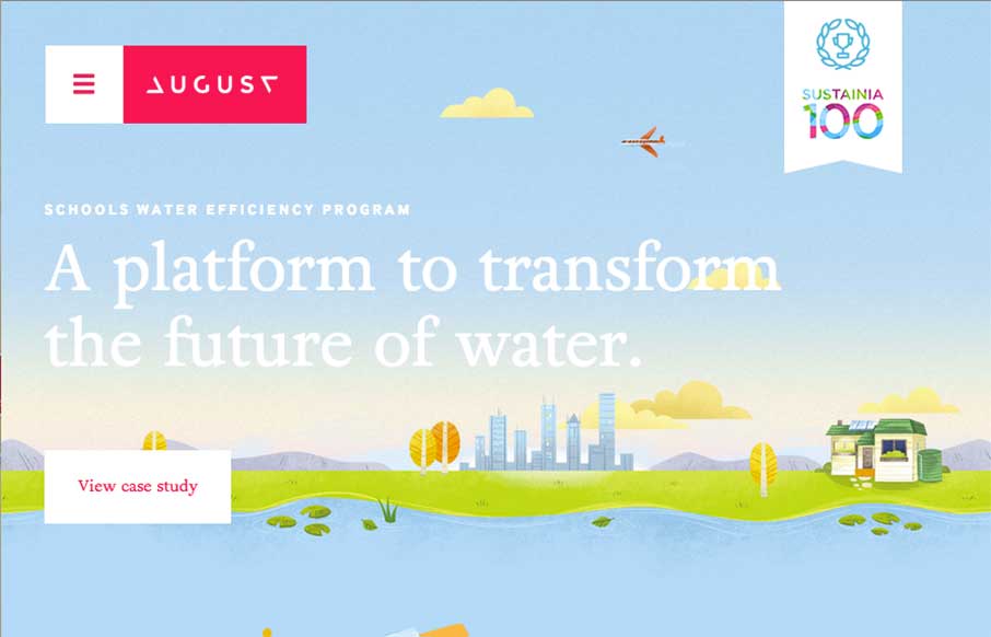
Man, what a beautifully executed design on the August website. Fun layout and some super slick illustrations and animation really drive this design home for me. The main navigation is very interesting too. It’s one of those that take over the design but I really dig the way they’ve approached it here and changed the paradigm a bit.
Glassmorphism: The Transparent Design Trend That Refuses to Fade
Glassmorphism brings transparency, depth, and light back into modern UI. Learn how this “frosted glass” design trend enhances hierarchy, focus, and atmosphere, plus how to implement it in CSS responsibly.


0 Comments