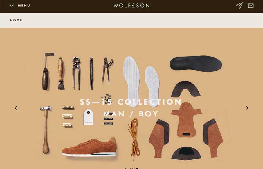
What a beautiful grid based layout for the Wolf and Son website. There isn’t much I don’t like about this site design. The colors and photography really just seal the deal to make this a really great looking site.
Glassmorphism: The Transparent Design Trend That Refuses to Fade
Glassmorphism brings transparency, depth, and light back into modern UI. Learn how this “frosted glass” design trend enhances hierarchy, focus, and atmosphere, plus how to implement it in CSS responsibly.


0 Comments