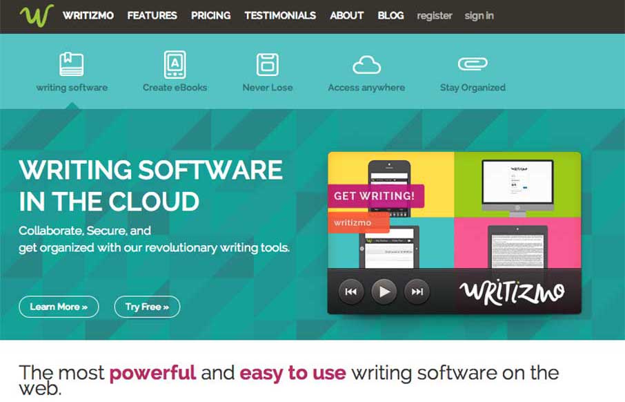
I like how Writizmo went with their main content in the hero area. The marketing messages / feature lists that a lot of web apps use are normally in a long scroll below the fold, or in a rotating barrage / slideshow that no one really looks at…( just sayin’). Get to the point, let people know that you know what they want (kudos). Besides that, the flat illustrations / cartoons are cool touch too – and a lot of them.
From the Designer: “Writizmo is offering an online writing software. It uses cloud computing technique, that allows you to write your article and save it on cloud. Considering the client’s requirements like responsive design, PSD to HTML theme conversion,e-commerce platform, payment gateway integration etc. we offered a solution in the support of their requirements. We added some modules in the admin panel, some plug-ins for ease and payment gateway integration to make the website e-commerce compliance.”
Submitted by: Maulik Shah
Twitter: @biztechltd
Role: Designer & Developer


0 Comments