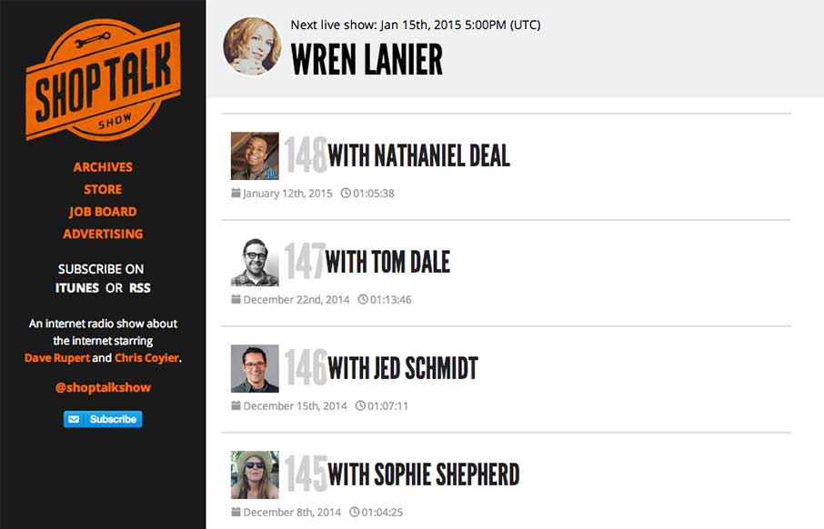
The new Shop Talk Show website is up. Retaining the same branding and colors but very much looks like it just goes straight for mobile users. Likely a very smart move. The content is in the audio and getting people to that fast not in showing off a super slick site design. Which is why it’s going in the UMS Gallery – we honor purpose and intent as much as beautiful layout around these parts.
Glassmorphism: The Transparent Design Trend That Refuses to Fade
Glassmorphism brings transparency, depth, and light back into modern UI. Learn how this “frosted glass” design trend enhances hierarchy, focus, and atmosphere, plus how to implement it in CSS responsibly.


0 Comments