As I’ve been gathering articles for our weekly interweb round-up called UnmatchedStyle Radar, I’ve noticed that the web design trends for 2015 articles are picking up and gathering steam. So… we’re riding the bandwagon with our own web design trends.
We want to do it a little differently though. We’ll share a few of the UnmatchedStyle’s staff predictions (um… educated guesses?) for these design trends, but also give you links and summaries to other designer / sites predictions – and ask you to participate by answering our quick survey below.
What we want to do each quarter of 2015 is then grade how these predictions are doing. It will be totally subjective I’m sure, but we believe between all of the websites that get submitted to UnmatchedStyle for our #UMSgallery reviews – plus the conferences we put on throughout the year (ConvergeSE, BDConf, FrontEndConf, Grok, and others) – we should be able to give you fair indication of where we’re going as an industry.
With that, here are our and everyone else’s predictions. We think you’ll be surprised how various these predictions will be.
Don’t forget to add your thoughts in our survey.
UnmatchedStyle Staff Web Design Trends for 2015 Predictions (Guesses?)
Gene Crawford – President / Designer – UnmatchedStyle & All The Conferences – @genecrawford
Navigation Design
We will continue to push the envelope on main site navigation design. The old Hamburger isn’t working like we really on it to work and things like overlay navigation is confusing. While these things are trendy they aren’t functional in the long run so we will see more holistic navigation patterns emerge as new websites are designed and built.
Motion
Flash is dead in the realm of front end web design these days but movement and animation are making a come back. There will probably be a lot more time spent on making interactions more interesting by incorporating animations or triggered movement as a user moves down a web page via scrolling or loading pages.
Performance
While not strictly a “visual trend”, web developers are going to need to focus on building the skill set needed to make their websites render faster and faster. Dev Ops skills aside, there’s plenty that can be done in the CSS and JavaScript build out that can assist in making things run more efficiently.
Giovanni Difeterici – Creative Director / Designer – UnmatchedStyle – @giodif
SVG
I think that designs will rely more heavily on vector graphics. SVG use and popularity is growing fast and offers a truly scalable and flexible image format. They allow designers to think less about screen resolution and pixel density and more about design.
GIF
The GIF format seems to be growing in popularity and many inventive uses for these animated images are popping up more and more often. GIFs offer an alternative to CSS animations and can allow designers to use graphical tools to create desired effects. They are relatively easy to create and simple to control. I think the inventive use of GIFs will grow over the next year or so.
System Design
The days of approaching web design on a page by page basis are largely over. Designers seem to be shifting from designing full layout to designing modular systems of elements and interactions. I think the trend will grow and we’ll see more modular, flexible sites that anticipate changing content and growth.
Jay Barry – Creative Director / Designer / Developer – Period Three / Drummer & Keyboards – Lunch Money (kindie band) – @petridisc
Most trends of the last couple of years have been a reaction to a multi-device world where sites should work everywhere.
Performance
“Make your web pages fast on all devices.” That’s the tagline when you’re about to paste in a url on Google’s PageSpeed Insights. The idea of optimizing for performance has long been the domain of geeky dev types. But the intersection of Responsive Design and the proliferation of devices with an endless variance of size, native speed and the speed of whatever network they’re on has made it impossible to ignore. This is going to continue to be something that designers and front-end developers focus on as they deploy sites that have to work everywhere and on any device.
https://developers.google.com/speed/pagespeed/insights/
https://kinsta.com/learn/page-speed/
Simple/Minimal Design
One of the reasons we’ve seen a trend of minimal and simple sites over the last couple of years is partly a function of Responsive Design being a hard thing to pull off effectively. A responsive site has to work in so many ways the last thing you want to do is create a super complex design that increases your development costs exponentially. It’s also perhaps a result of increasing use of frameworks like Bootstrap and Foundation. It’s also true that it’s simply an aesthetic thing, and purely visual things also have a tendency to go in and out of fashion. All that is to say that the current trend of large photos, small text, and lots of boxes isn’t going anywhere soon.
https://unmatchedstyle.com/gallery
SVG and SVG Animation
The beauty of SVG is that it’s a vector format, meaning that it can be scaled while retaining it’s sharpness. In addition to that with the SMIL specification, you can animate SVG elements. Basically, each SVG has it’s own DOM which you can manipulate with CSS and/or Javascript. Support is fairly comprehensive except for all IE’s, but that can be mitigated by use of libraries like Snap. I’m looking forward to seeing more examples of SVG being used on production next year.
http://css-tricks.com/guide-svg-animations-smil/
Your Turn – What Are Your Top Web Design Trends For 2015?
[wufoo username=”period3″ formhash=”m7fogdq1mzcsca” autoresize=”true” height=”595″ header=”show” ssl=”true”]
2015 Web Design Trends Predictions Across The Interwebs
50+ Designers Share Their Top 3 Design Trends for 2015 – Founders Grid

Founders Grid, “wanted to learn what design trends we will see more off during 2015, so we reached out to some of the most respected designers out there to ask what design trends they expect will continue to gain traction during 2015.” Some of the most popular design trends from these designers are in the areas of:
- Typography
- Responsive design
- Material design
- Focus on speed
- Focus on users
17 crucial web design trends for 2015 – E-Consultancy
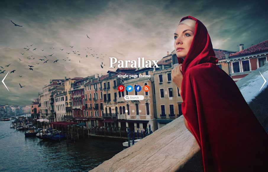
Great article by Christopher Ratcliff from E-Consultancy. Main points:
- Parallax scrolling for everybody
- Card design
- Material design
- Ghost buttons
- Speed
- Micro UX
- Hidden menus
- Pinned elements
- Scrolling not clicking
- Upwardly responsible
- Motion design
- Big fonts
- Shades of color
- Super-navigation
- Mobile first, but not only
Web Design Trends 2015 – Graphic Design Junction
Graphic Design Junction’s Muhammad Faisal sees the following trends continuing:
- A picture is worth a thousand words / flat design
- Responsive design
- The background of the web pages / image / video
20 Web Design Trends You Can Expect to See in 2015 – Red Website Design
Building off of the Founders Grid article, Mark Ford from Red Website Design in the UK has a great infographic on design trends for next year. Looking through, I think literally everything is in there:
- Material Design
- Typography
- Mobile Optimization
- SVG
- Flat Design
- Wearables
- Full-Screen Media
- Bigger Text & Bigger Image Driven Websites
- Cards, Cards, Cards
- Animation
- Performance
- More Pixels
- Patterns
- Low Poly Style
- Long Scroll


These are all great design trends… Thank you for the great article, in my personal time I design websites and I will be keeping these all in mind. My favorite is the flat design. You can do so much with it and it helps makes a site look professional AND its easy to implement! 🙂 Wish I could say I got to use these at work!
Hi Megan – thanks for the shout out! I think you’ll see a lot more flat design this year on smaller sites or hipper companies that experiment… which means that it may be a couple of years before we see it in corporate / enterprise sites. Maybe your new side project (that leads to better things?)
Hi there, I really enjoyed reading your article. You’ve shared some great design trends. Thank you for the great article! My favourite is the flat design. I agree that you can do so much with this design, and what’s beneficial is that it helps make a website look professional.
Thanks for sharing this post. I am new to website development and designing. It will help me a lot in my professional career.