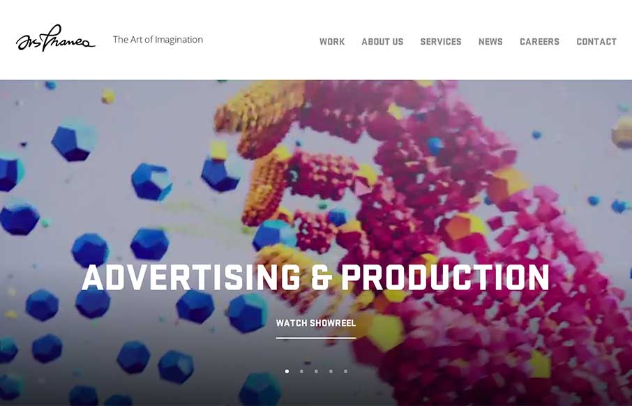
Crash, bang, wow! Ars Thanea’s agency site is a visual assault on your senses – that’s a good thing. The video background / slideshow on the home page actually makes you stay on the page / and watch a slideshow. Cool how when you mouse to the left or right of the screen on the slideshow, you get a peek of what’s next. I haven’t seen too many agency / portfolios have video background on their “Work” pages, and was concerned about speed of the site, but it looks like the video loads on-scroll, so that makes it even better. How does it load for the rest of you?
Glassmorphism: The Transparent Design Trend That Refuses to Fade
Glassmorphism brings transparency, depth, and light back into modern UI. Learn how this “frosted glass” design trend enhances hierarchy, focus, and atmosphere, plus how to implement it in CSS responsibly.


I think this site seems to be have some issue