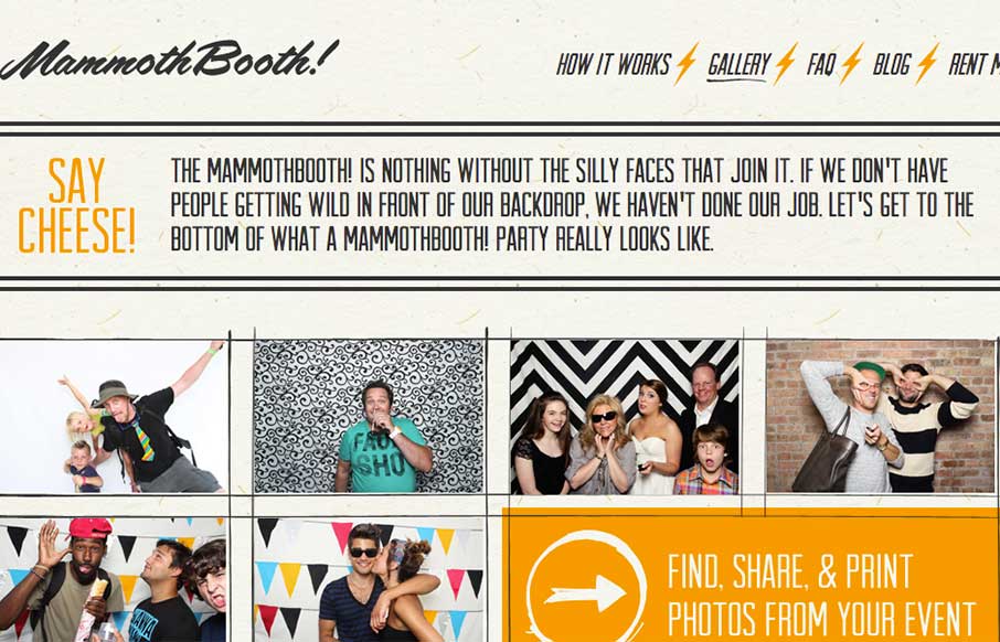
Listen… good marketing is this: Do Not Press Button. What’s the first thing you want to do? This is how the Mammoth Booth site starts out – good irreverence coupled with some nifty illustration and CSS animation, and then the pay-off: an explosion of cool photos taken from their photo booth. I mean, look at this dude:

Also, really great use of fonts and large, high resolution images that let’s their product and the experience shine through. I even went through their galleries, so now I know how people from Detroit and Chicago party. Apparently a little more fun than the dude previously shown…


0 Comments