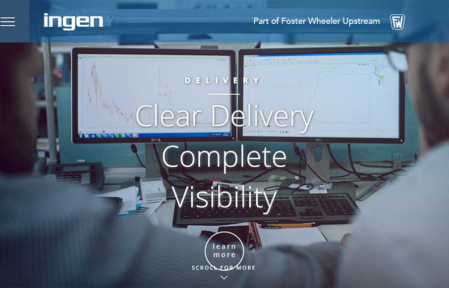
Very clean design on the home page – content pages are clean too, but a bunch of text (which may make sense for this type of client). I like the approach of making the site ready for mobile by going ahead and making the hamburger menu the main nav. Below, the designer says that it was built in 10 days – if you have it ready for mobile like this, then it helps streamline the responsive design workflow.
Submitted By: Sam Longmire
Role: Designer
“A very different approach to digital for this industry. Global Oil and Gas consultants tend to stick to very dry web templates coupled with stock images of the planet earth and people with colgate smiles. We challenged this idea from the start. We worked very closely with the client to understand how their business model works, their USP’s and why they get out of bed in the morning. It turns out we showed them that their people were their biggest asset. We discovered that despite the big money marketing behind their competitors, it was in fact not B2B but H2H. We humanised their brand/their approach and there digital presence. and it looks okay too! Oh and the site was built inside 10 days. Client demands – always the fun part!”


0 Comments