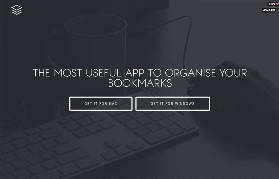
Nice dark design. You don’t see too many sites done using dark background this well. I also really like the main/hero image of the app screenshot and how it lifts up and loads more into view when you mouse over it.
Glassmorphism: The Transparent Design Trend That Refuses to Fade
Glassmorphism brings transparency, depth, and light back into modern UI. Learn how this “frosted glass” design trend enhances hierarchy, focus, and atmosphere, plus how to implement it in CSS responsibly.


0 Comments