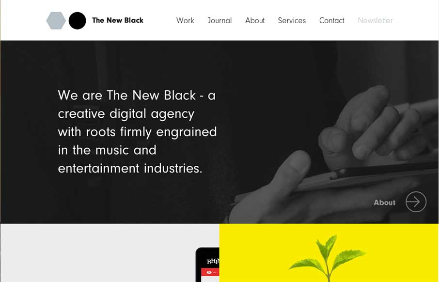
I love the design for The New Black a lot. It’s traditional in the way it uses the horizontal header bar, but very much not so in the way it’s blocked out and uses interaction to get you involved in mousing around the page. Awesome stuff, done simply. Get’s me every time.
Glassmorphism: The Transparent Design Trend That Refuses to Fade
Glassmorphism brings transparency, depth, and light back into modern UI. Learn how this “frosted glass” design trend enhances hierarchy, focus, and atmosphere, plus how to implement it in CSS responsibly.


0 Comments